
A website that changes its message for each member it’s talking to.
Vision Super is a not for profit industry super fund. I designed a component system for its public website, a set of landing pages matched to each audience its ads targeted, and a members portal where people log in to see and manage their super.
The work
Component library, audience landing templates, lead gen pages, mega menu, forms and publications library, content and resource templates, members portal (desktop, widescreen and mobile)
The challenge
A super fund talks to very different people. A 28 year old wants to grow their balance. A 60 year old is planning how to draw it down. An employer needs forms and contribution details. Each one arrives with a different question.
Vision Super was running ads to several of these groups at once. Sending all of them to the same home page meant every visitor had to hunt for the part that applied to them. The fund also needed a members area people would actually use: one place to check their balance, change investments and update their details.
What I built: one component system, many pages
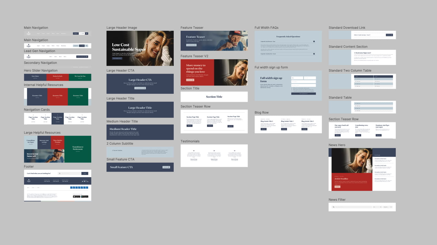
I designed the public site as a library of about 30 reusable sections. Any page, from a campaign landing page to a forms library, is assembled from the same parts. The fund’s team can build a new page for a new audience without a new design job.
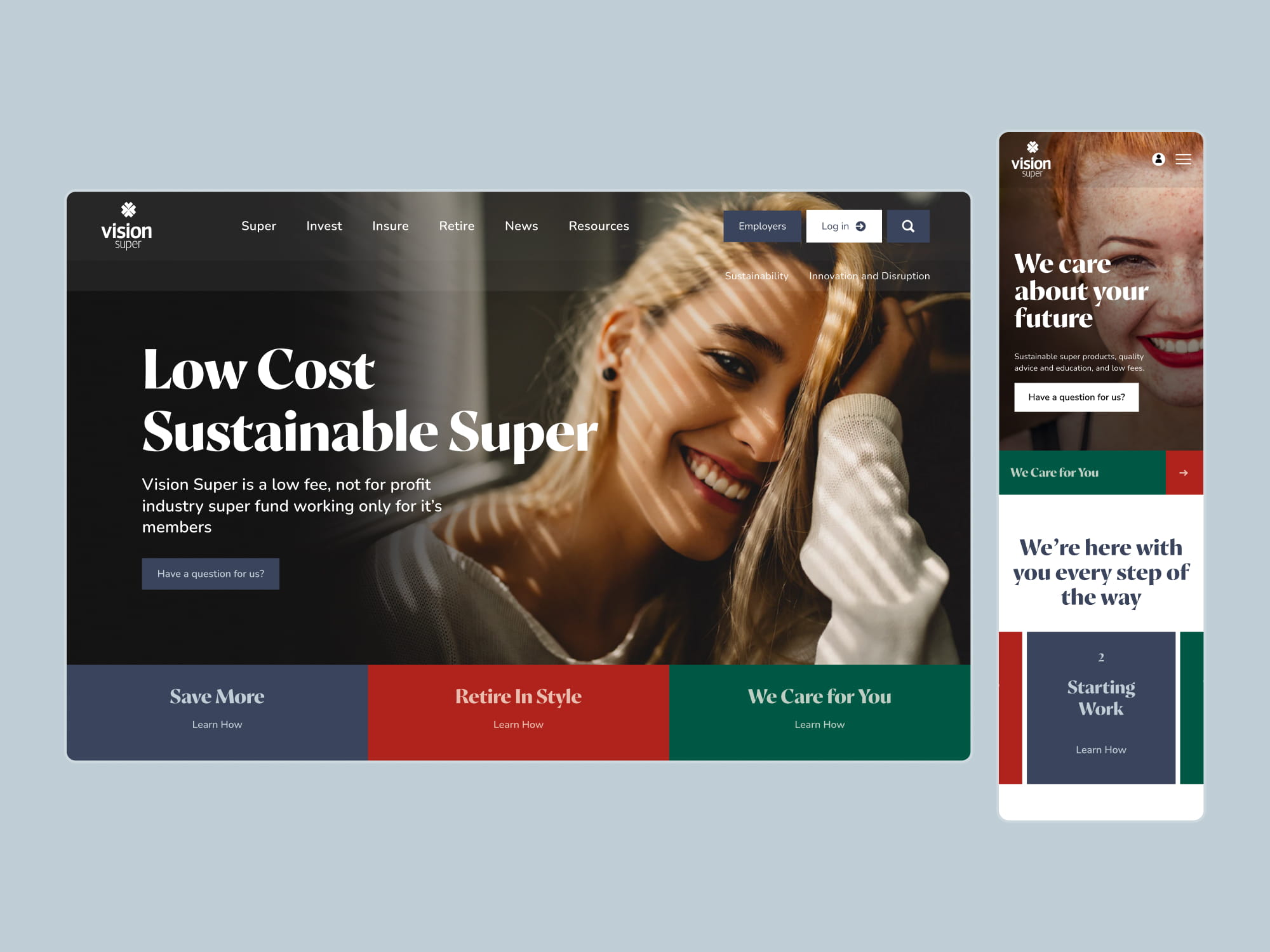
Pages matched to each audience. The home page hero leads with three paths: Save More, Retire in Style and We Care for You. Each ad campaign pointed to its own version of the page, so a visitor who clicked a retirement ad landed on a retirement message. Supporting tiles carried the same idea further: Consolidate my Super, Increase your Savings, Three Bucket Pension and Transition to Retirement.
Lead gen pages. For campaigns I designed a stripped back page with a simpler navigation and a single action: Become a member today. Product campaigns for the Sustainable and Innovation and Disruption investment options had their own sign up form, where a visitor could join an option or ask to be contacted.
Tools that start a conversation. Feature banners pointed visitors to the Future Lifestyle Calculator, with lines like “More money to spend on the things you love”.
A forms and publications library. One searchable page holds every document a member or employer might need, filtered by Publications, Reports, Fact Sheets, Guides, Annual Reports and Newsletters. Each item has its own download button, so finding last year’s annual report takes two clicks. Product pages use the same download rows, alongside comparison tables and FAQs.
News and articles. A news hub with a lead article, a Must Reads column of personalised article picks, search and category filters, and blog teaser rows that can sit on any page.
A mega menu that does the sorting. Each top level item (Super, Invest, Insure, Retire, News, Resources) opens a panel with described links, quick links to Publications, FAQs and Calculators, a featured campaign, and the member, employer and retirement hotlines with Live Chat and a Join us today button. Visitors see where they’re going before they click.
The rest of the site. Templates for Accessing your Super, Calculators, FAQs, About us with board and executive profiles, and Contact. Every page shares the same header, testimonials, site search and footer with hotlines, ratings badges and app downloads.
The members portal
The portal uses the same type, colour and components as the public site, so moving from browsing to logging in feels like one product.
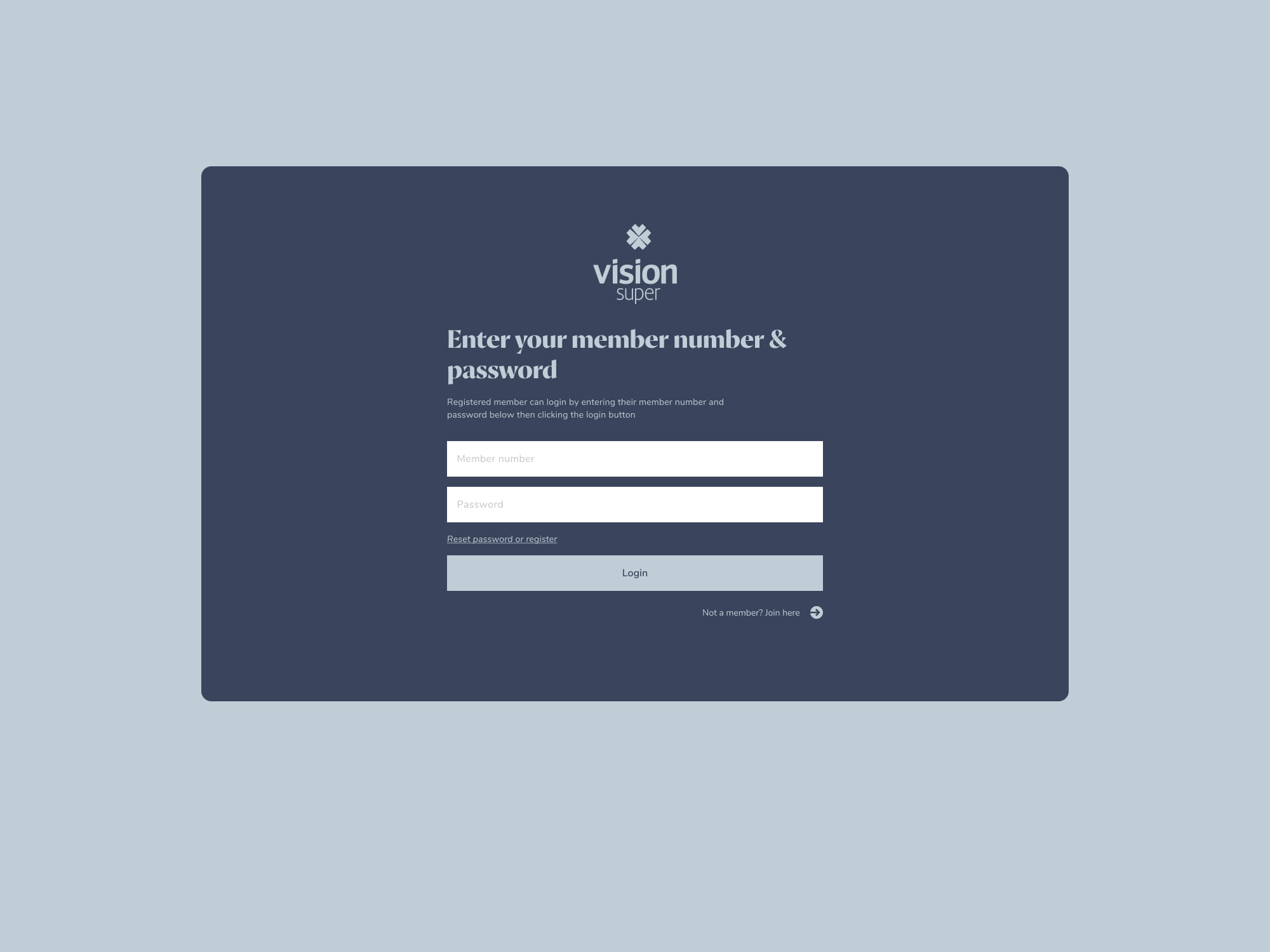
- Log in and join. Members sign in with their member number and password. New members join through a single guided form covering personal details and addresses, with clear error states.
- A personal dashboard. Members are greeted by name and see a Balance Snapshot: their total balance and a chart of how it has changed over five years.
- Six common tasks up front. View Transactions, Check your Investments, Help with Insurances, Make a Contribution, Update Personal Details and Update Beneficiary.
- Investments. A breakdown of each investment option by value, balance split and future contribution split, with a path to change investments and an export to PDF.
- Account areas. Account Summary, Transactions, Beneficiaries, Account and My Details, each with its own side navigation.
- Prompts inside the portal. The same feature banners from the public site appear here, so a logged in member still sees the Future Lifestyle Calculator.
- Every screen size. Desktop, 1920px widescreen and mobile layouts, plus warning messages, a data entry error dialog and a date picker.
What this means for your firm
The thinking carries straight across to accounting, legal, advisory and broking firms. They have the same problem: several kinds of client, each arriving from a different ad, referral or search with a different question.
- A landing page for each client type turns ad spend into enquiries, because the page answers the question the ad raised.
- A component system lets your team publish new service pages and campaigns in hours, with every page staying on brand.
- A resource library keeps forms, guides and reports in one place clients can find.
- A client login gives existing clients a reason to come back, and keeps them warm for the next service.
If your website sends every visitor to the same page, I can help you build one that speaks to each client you want more of.
More work.





Want the same for your firm?
Short video. Three recommended changes. No call required.