
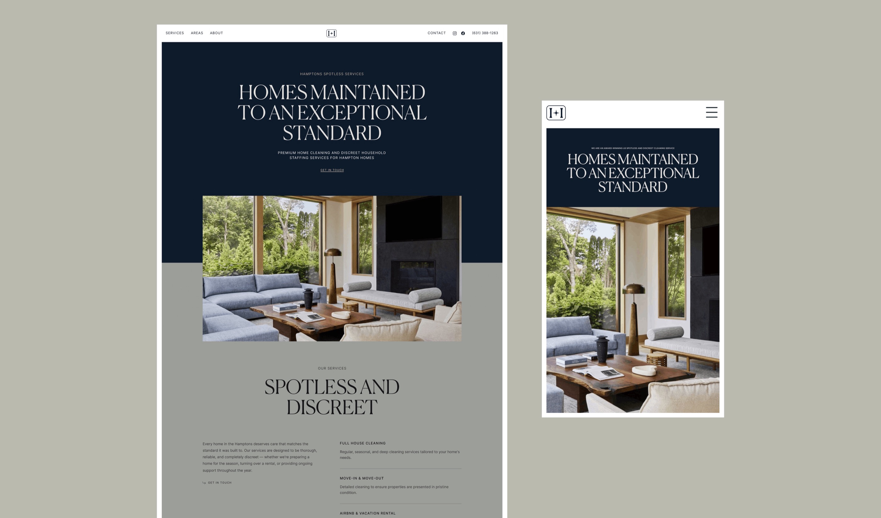
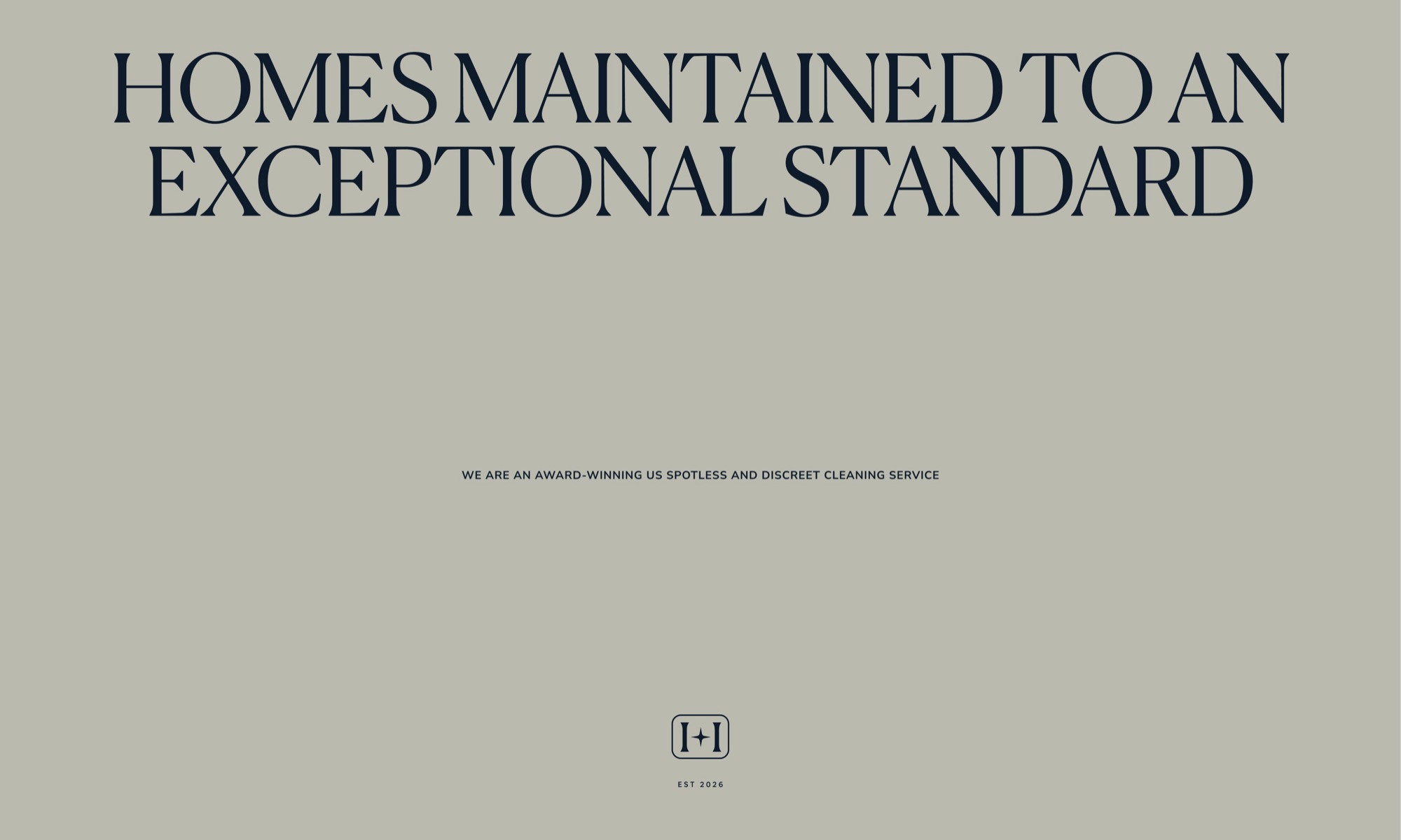
A new home-care company in the Hamptons needed a finished brand and a launch-ready website. In a two-week brand sprint I refined the mark, built the brand system around it, and designed a static website ready to launch and grow into.
The challenge
Hamptons Spotless Services was launching premium home cleaning and household staff services across the East End, from Southampton to Montauk. They had an early logo they weren't convinced by, no wider brand, and no website. They needed a finished identity and a site that felt at home among the architects, interior designers and landscapers their clients already trust, all in a two-week brand sprint, with room to build it out later.
The approach
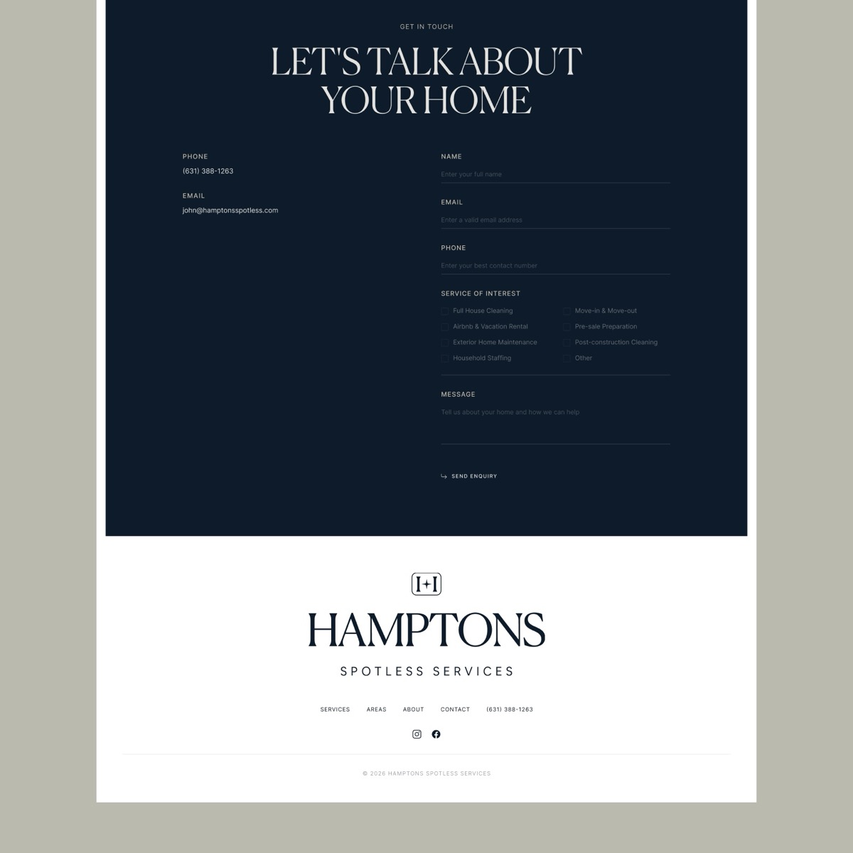
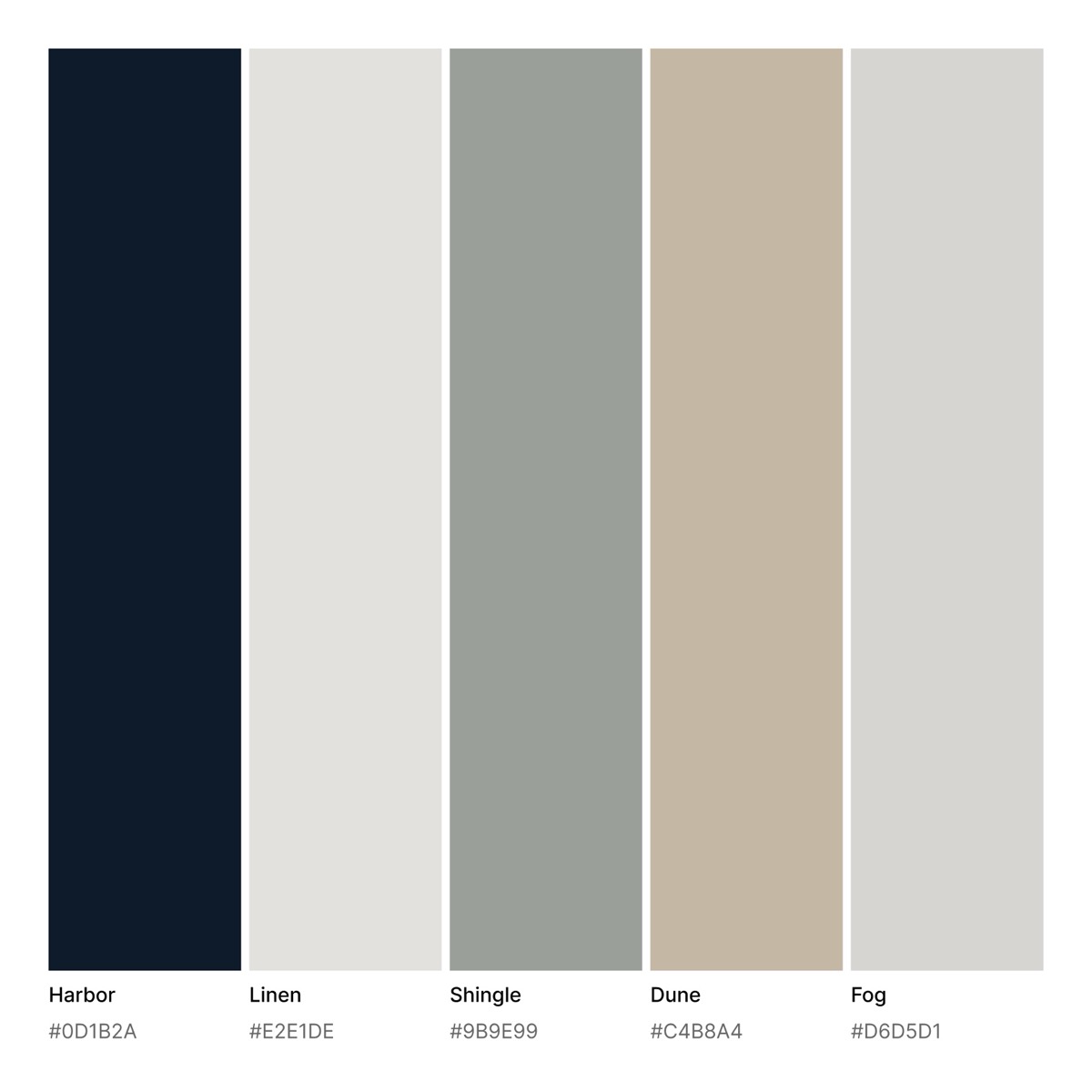
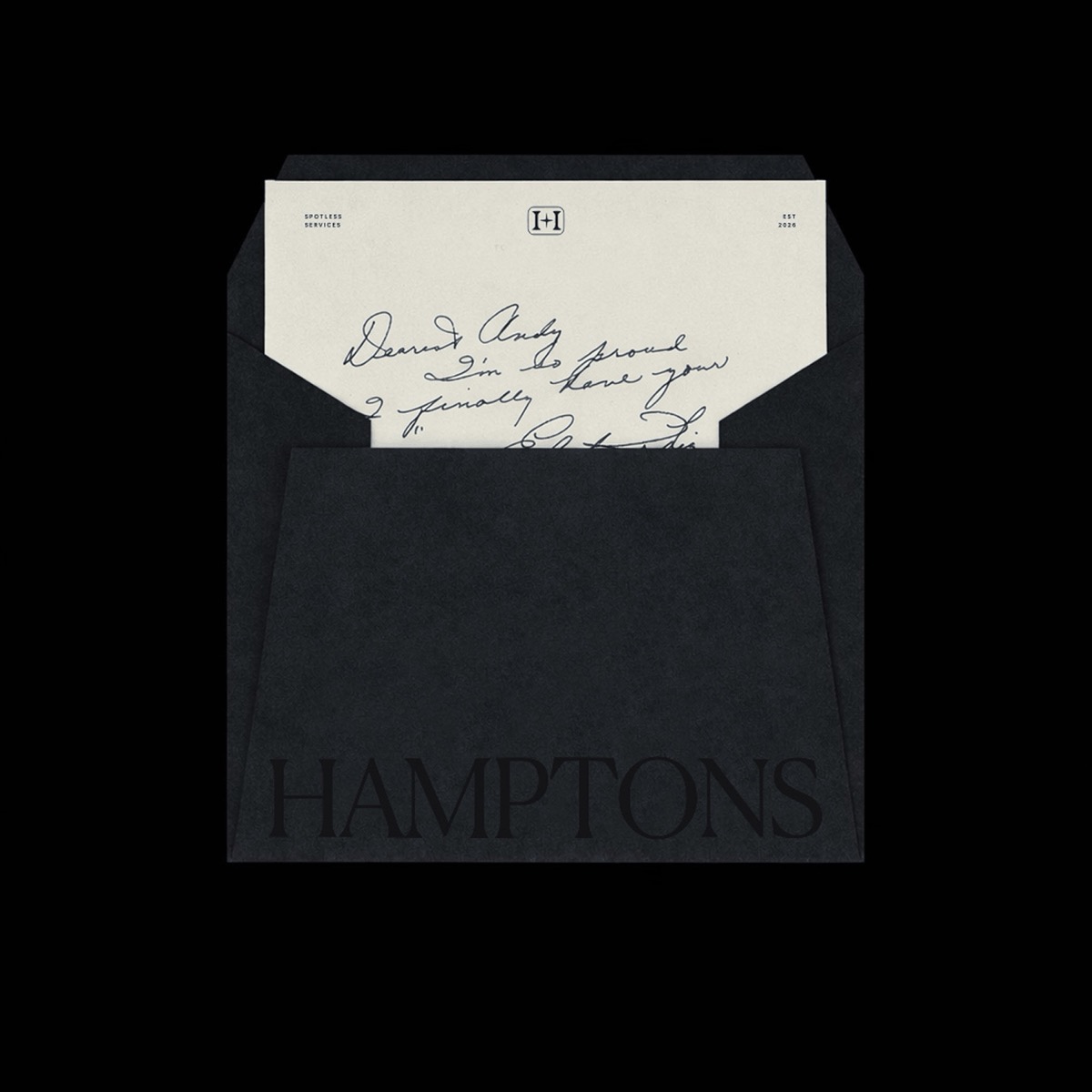
I explored two directions and we settled on The Hallmark: an H monogram that reads as a seal of quality, warm and structured without being stiff. From there I built the system around it, a deep harbor navy anchored by linen, shingle grey and dune, a classic serif for display, and stationery that carries the same restraint. For the website I started in greyscale to lock the structure and copy first, then applied the brand into a calm, editorial layout that gives each service room to breathe. All inside two weeks.
The result
Hamptons Spotless Services now has a cohesive identity and a static website that presents their cleaning, staffing and vacation-rental services clearly, with a contact form that routes enquiries straight to the team. It reads premium and discreet, matching the standard of the homes they look after, and it is built so new sections and pages can be added as the business grows.

Every engagement begins with a 15-minute discovery call. No pitch. I’ll tell you if it’s a fit.