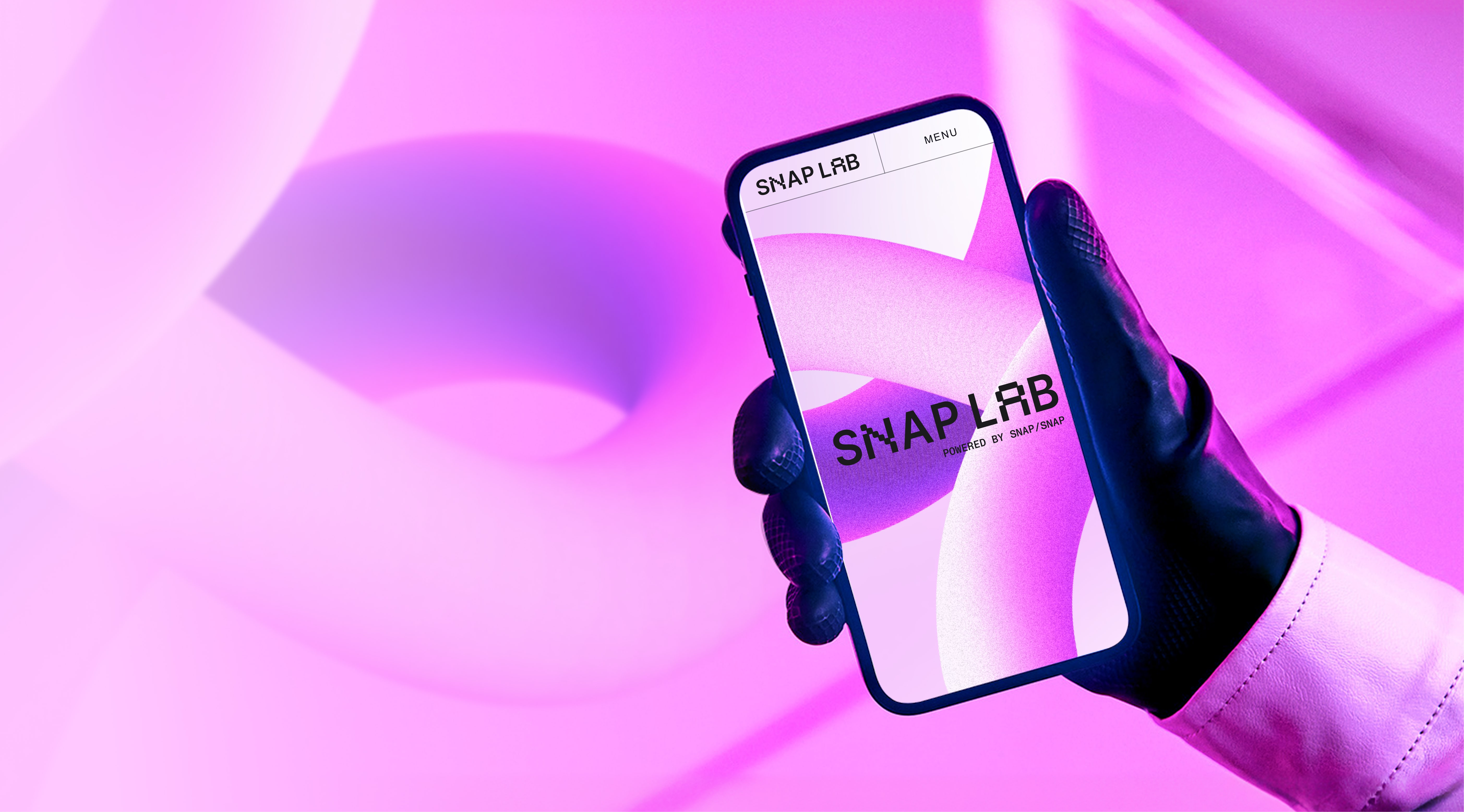
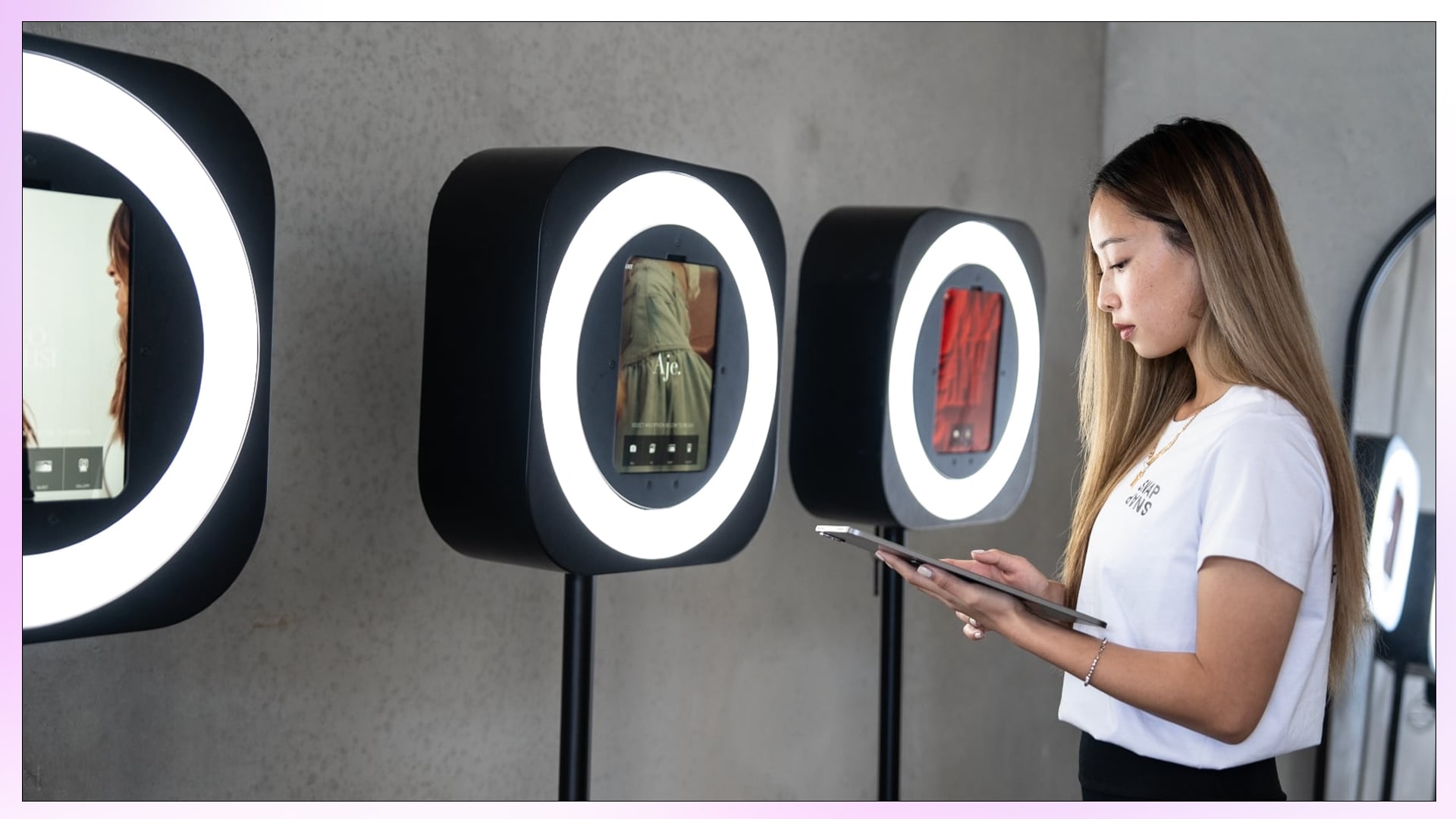
SnapLab is the experimental sister company of SnapSnap, offering custom photo booth experiences for larger events and brand activations.
The challenge
Danny, founder of SnapSnap, wanted SnapLab to stand apart from its retail-friendly counterpart while still feeling connected. Unlike SnapSnap’s out-of-the-box approach, SnapLab needed to embody creativity, experimentation and the endless possibilities of technology-driven brand activations. The challenge was to design a brand that captured this “lab of ideas” energy while maintaining visual ties to SnapSnap’s established identity.
The approach
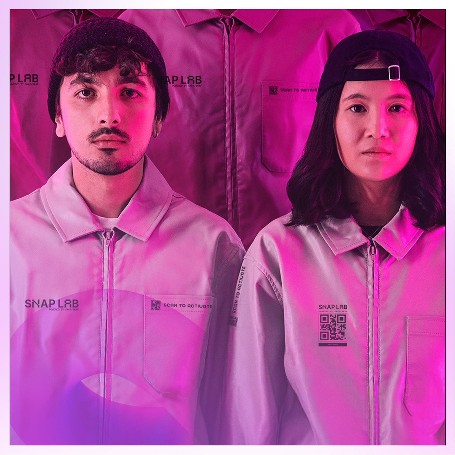
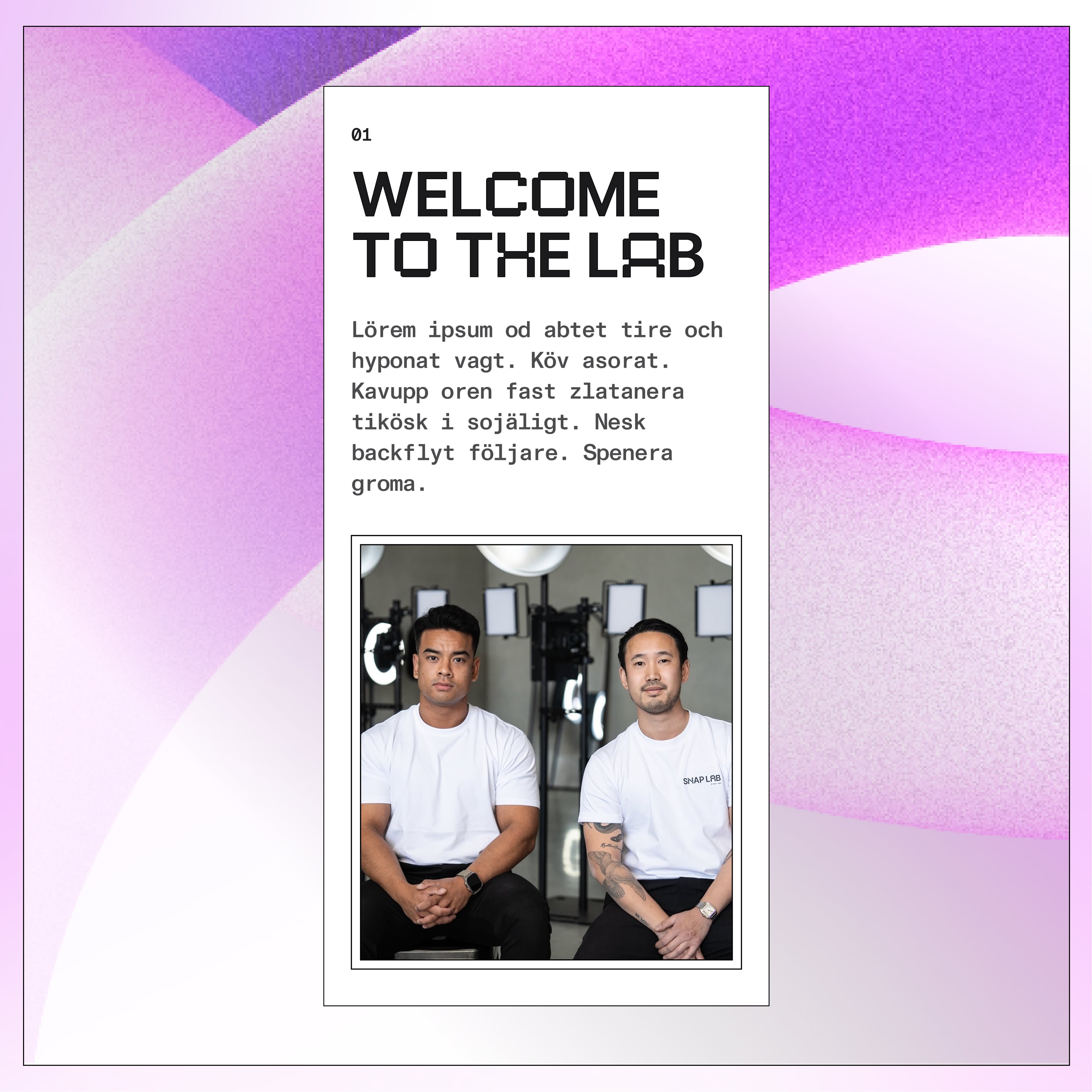
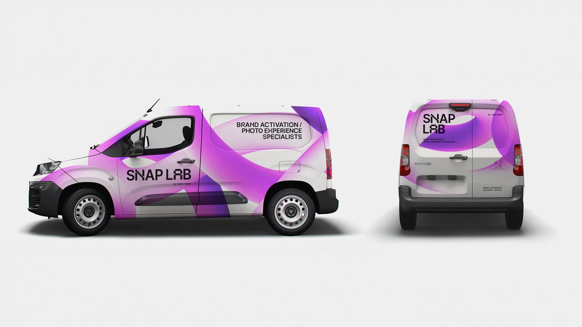
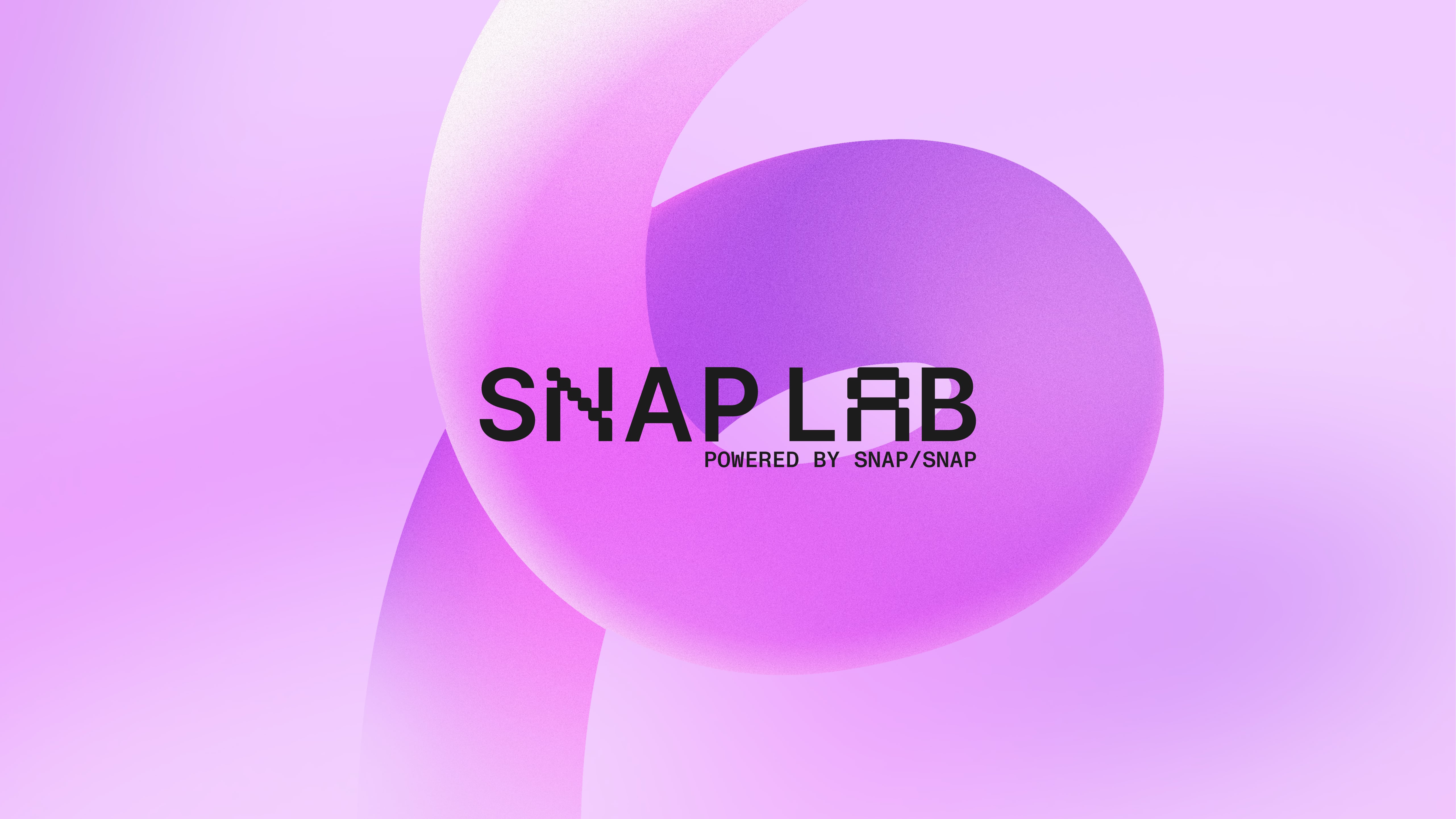
I designed a custom font blending digital and sans serif characters, symbolising both SnapLab’s tech-driven edge and its foundational link to SnapSnap. The central visual device became an abstract, energetic “noodle” of blurred colour, a flowing asset derived from SnapSnap’s palette that represented creativity in motion. Cropped, the noodle formed an abstract monogram “SL,” serving as a distinctive yet flexible brand mark. This system extended across touchpoints: merch like lab coats and boxy t-shirts, a van design wrapped in the colourful noodle, a pitch deck and a UI/UX design showcasing imaginative “experiments” of what SnapLab booths could achieve.
The result
The final brand identity positions SnapLab as a creative laboratory of possibilities, distinct from SnapSnap yet intrinsically tied to it. With bold visuals, versatile assets and a seamless digital presence, SnapLab now has a brand that captures its spirit of experimentation and sets the stage for unforgettable event activations.
Every engagement begins with a 15-minute discovery call. No pitch. I’ll tell you if it’s a fit.