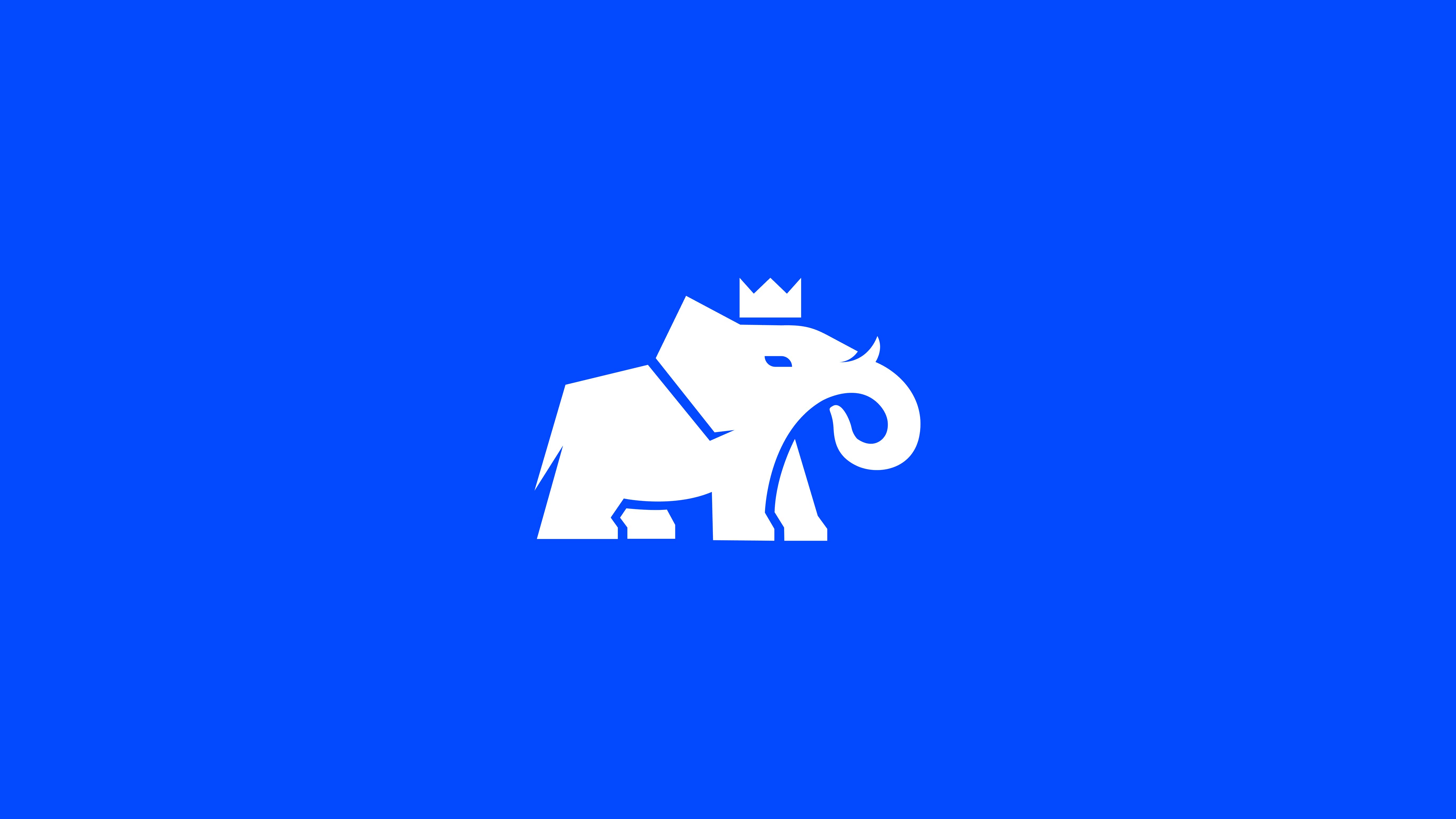
Lift Master is a crane truck specialist with 20+ years of expertise, delivering bold solutions that do the heavy lifting on construction and building sites.
The challenge
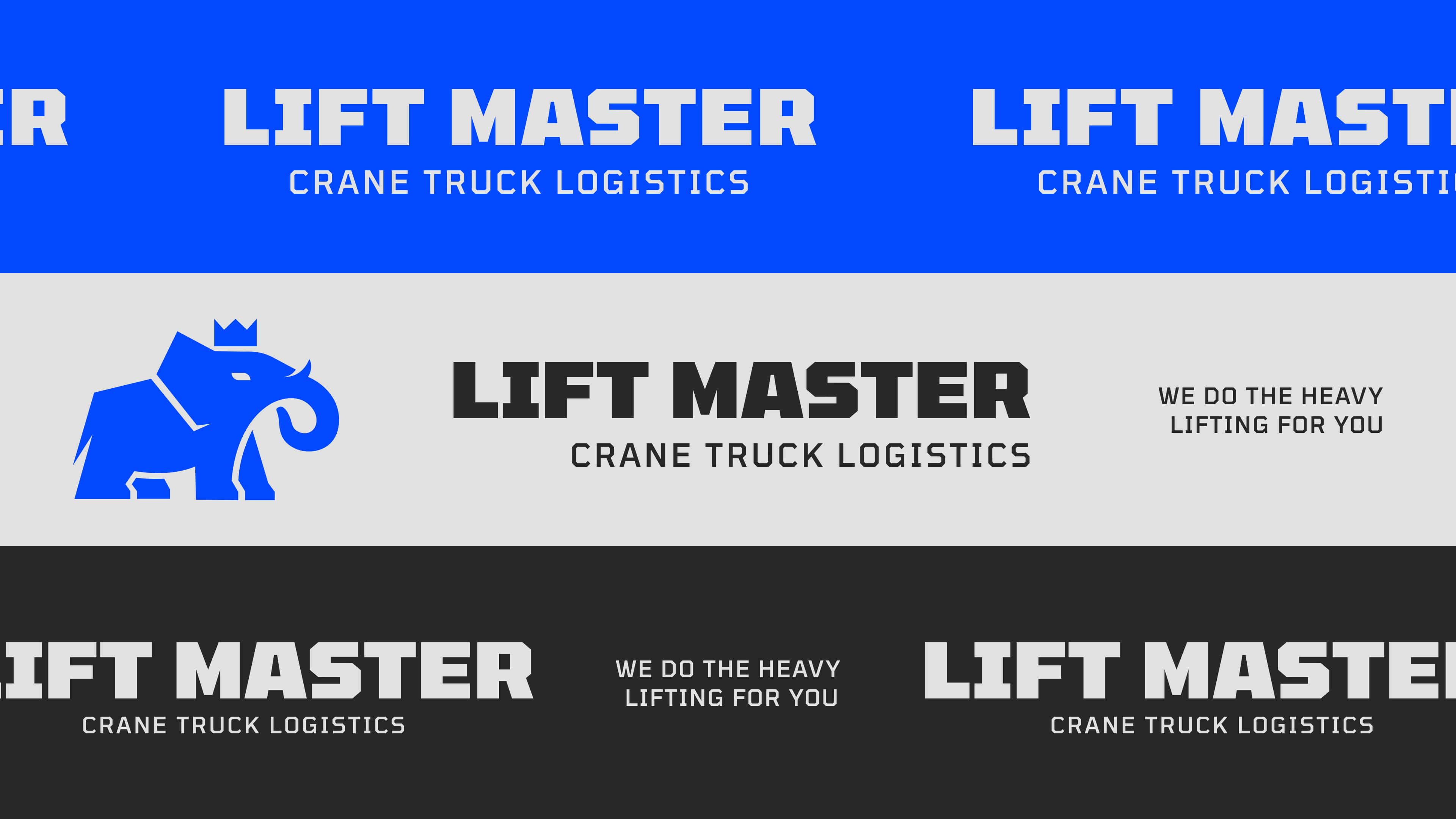
Jack, the founder, approached me with a clear brief: a bold, modern and tough identity that captured the grit of his work while incorporating an elephant as a symbol of strength. With specific imagery in mind, the challenge was to refine his vision into a professional, versatile brand that could stand tall across trucks, merchandise and digital touchpoints.
The approach
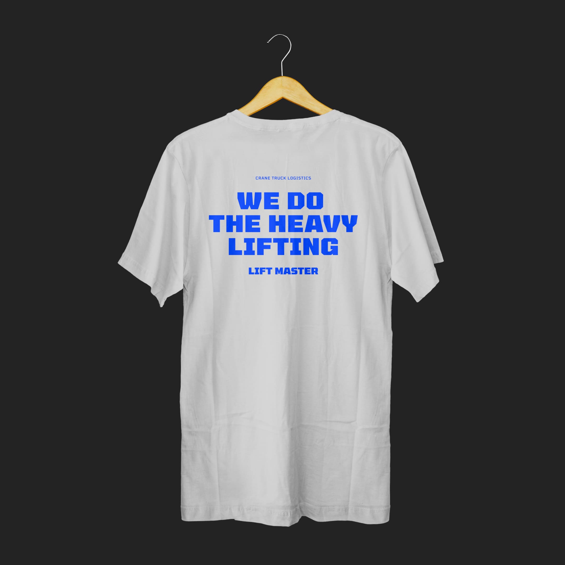
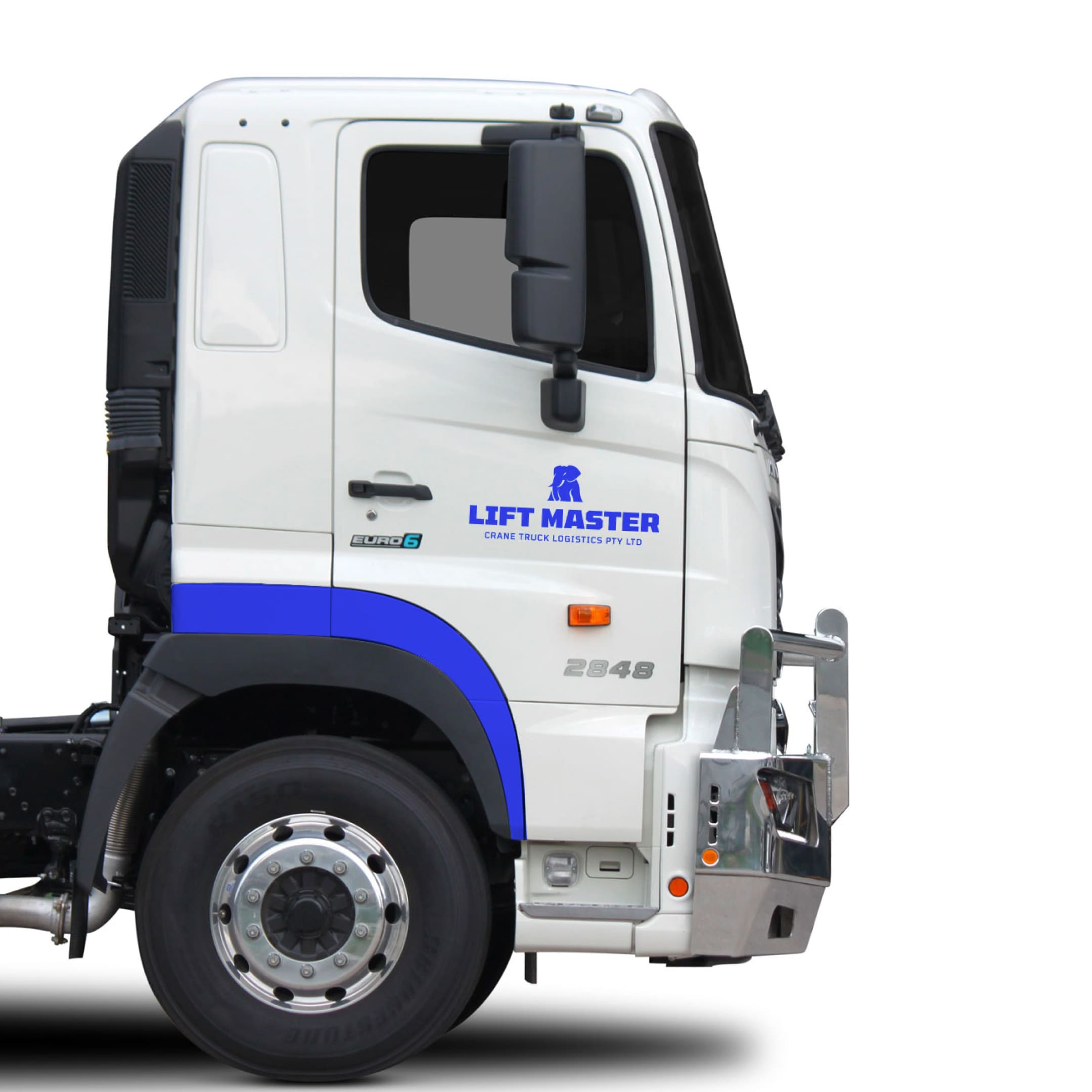
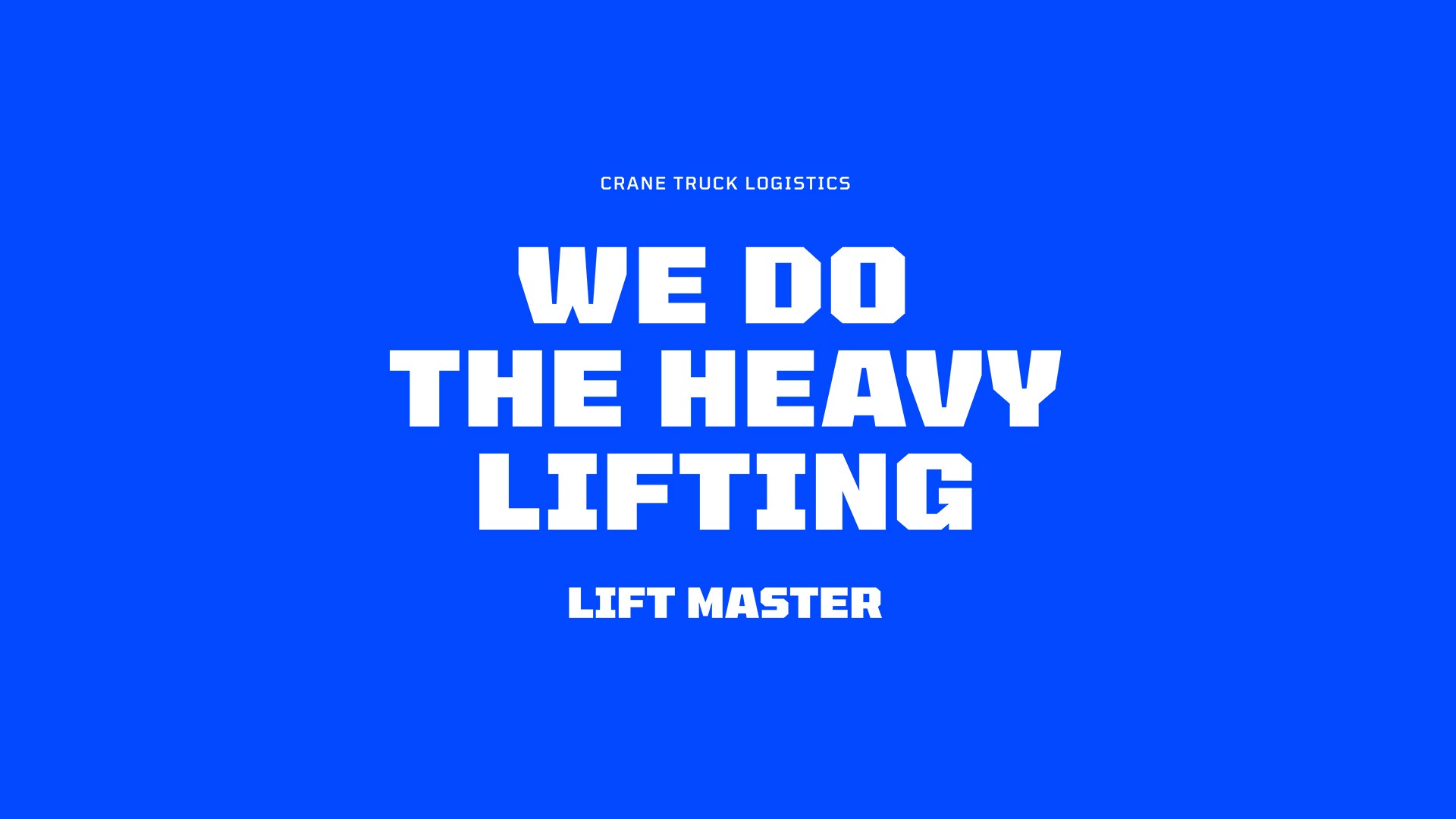
Rather than exploring multiple directions, I streamlined the process, presenting two focused logo concepts that combined a stylised elephant with strong, modern typography. The chosen direction embraced a bold blue and light grey palette, evoking trust, durability and a contemporary edge. From there, I expanded the identity into a cohesive system, with mockups for branded trucks, merchandise and a detailed style guide ensuring the brand was ready for every application.
The result
The Lift Master brand strikes a balance between the founder’s vision and a professional finish, resulting in a bold identity that reflects strength, reliability and industry expertise. With its iconic elephant mark and practical style guide, Lift Master is equipped to stand out and carry weight in the construction world.
Every engagement begins with a 15-minute discovery call. No pitch. I’ll tell you if it’s a fit.